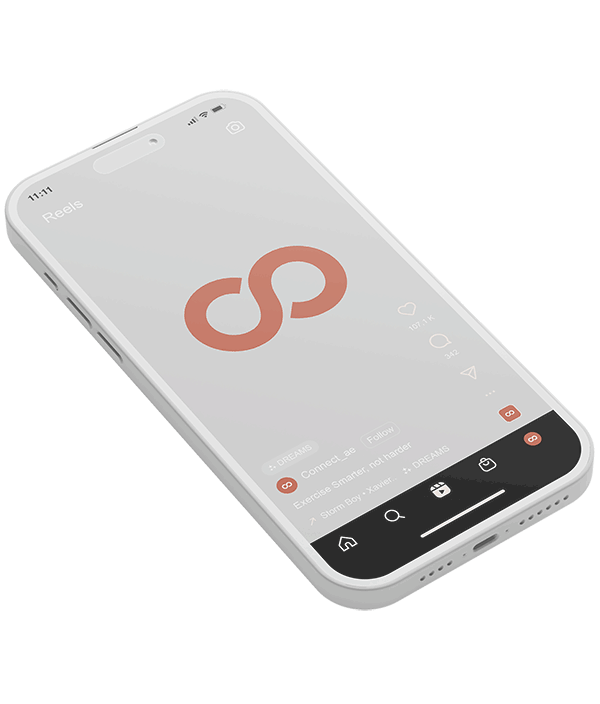
We centered the brand around three key pillars: flexibility, transformation, and continuity - core aspects of both body and mind. To reflect these principles, we designed the infinity monogram by combining the letters 'c' and 'o', aligning the brand visually with Connect core values.
We created this tumbler as a promotional item for the studio, showcasing its primary color and logo to enhance brand recognition.
Fonts & colors
Our choice of Proxima Nova Bold and Proxima Nova Light Italic fonts captures the essence of stability and adaptability for the brand.
Complementing this, the main color chosen for Connect, coral red, embodies self-love. The secondary palette, featuring green, blue, and yellow, draws from health, nature, education, and energy.